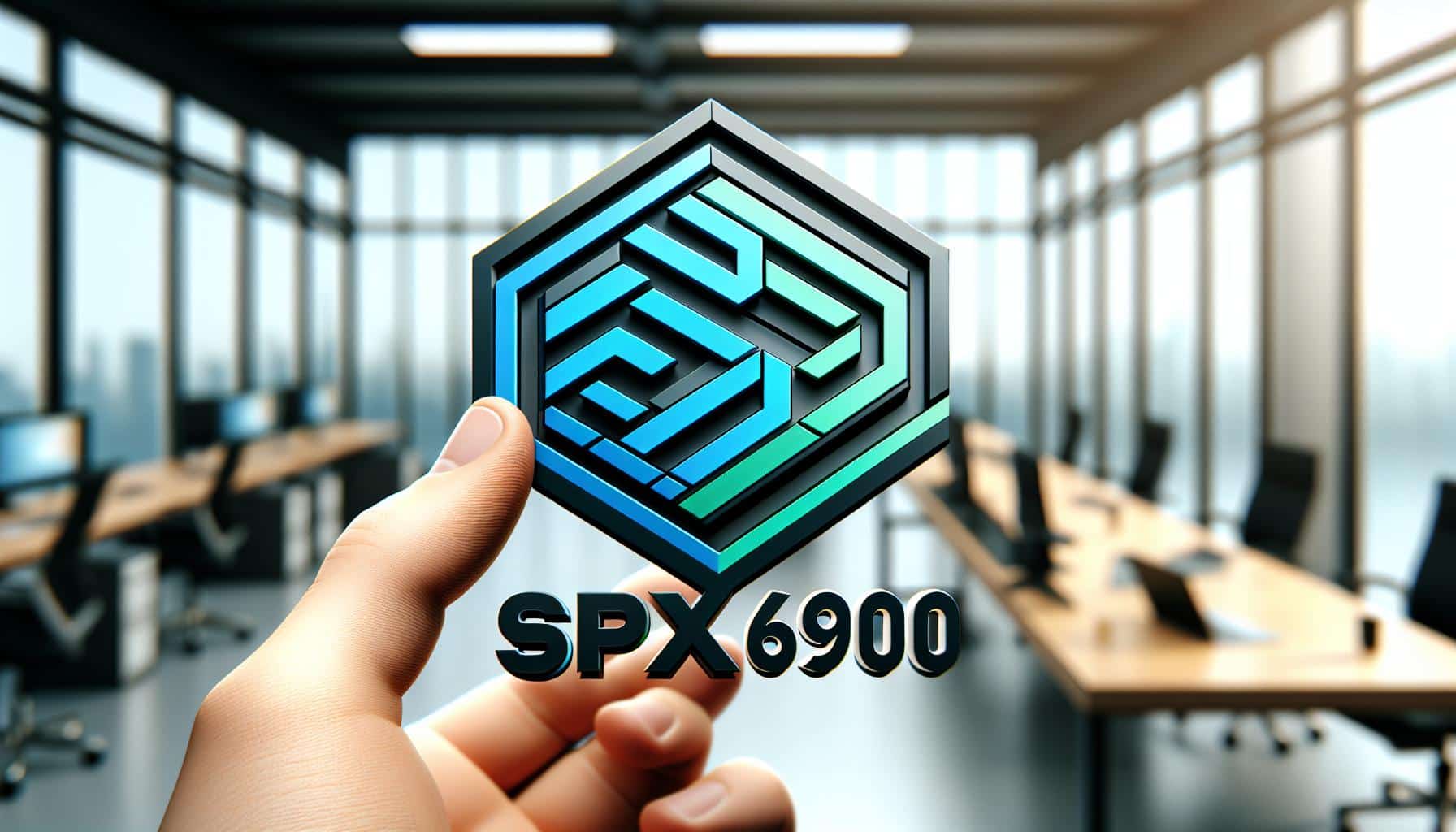

In crypto, a logo carries much of a project’s identity. The SPX6900 logo is more than a decorative mark: it is the visual shorthand that holders, traders, and newcomers use to recognize the project across websites, social feeds, and merchandise. SPX6900 (SPX) is not a conventional company, though. The official SPX6900 website describes it as a meme token created for entertainment purposes only, with no association with any stocks, equities, securities, indices, or companies. That context shapes how its branding should be read: playful in premise, consistent in execution.
Key Takeaways
- Memecoin identity: SPX6900 is a cultural memecoin framed as a satirical and conceptual challenge to the traditional S&P 500 stock market index, so its branding plays with financial imagery rather than corporate convention.
- Distinctive design elements: The logo pairs a palette of blue and green with bold, sans-serif typography for readability and recall.
- Minimalist and geometric style: Clean lines and geometric shapes keep the mark simple and versatile across formats and sizes.
- Consistent multi-platform usage: The logo appears across the project website, social profiles, listings, and merchandise, and official graphics are freely available for community use.
What SPX6900 Actually Is
Before looking at the design itself, it helps to understand what the mark represents. CoinGecko describes SPX6900 as a cultural memecoin project designed as a satirical and conceptual challenge to the traditional S&P 500 stock market index. The project’s own site is equally direct: SPX6900 exists for entertainment, not as an equity, security, or index product. A logo for a project like this has a different job than a corporate wordmark. It needs to be instantly recognizable in fast-moving social feeds and flexible enough to live on everything from exchange listings to stickers.
Overview of the SPX6900 Logo
The SPX6900 logo serves as a pivotal element in establishing the identity of SPX6900 (SPX), a cultural memecoin positioned as a satirical challenge to the traditional S&P 500 stock market index. The mark uses a modern color scheme, clean typography, and subtle graphical elements balanced to keep the design simple while still giving it depth. The result is a logo that stays legible at small sizes and recognizable at a glance, which matters when the same image has to work as a tiny token icon on a price tracker and as large-format artwork on merchandise.
Design Elements
Color Scheme
The logo’s palette draws on shades of blue and green. Blue conveys trust and reliability, while green signals growth. The combination gives the mark a clean, contemporary feel and helps it stand out across the many platforms and mediums where the community reproduces it.
Typography
Bold, clean sans-serif type keeps the branding readable and memorable across platforms and sizes. The sans-serif treatment supports the overall minimalist aesthetic, maintaining simplicity without sacrificing clarity.
Symbolism
Geometric shapes and clean lines give the mark structure. Because the design stays minimalist, that symbolism remains clear and uncluttered rather than competing with decorative detail.
Usage and Applications
Consistency is where a memecoin logo earns its keep. The SPX6900 mark shows up on the project website and social profiles, and on the token pages of price trackers such as CoinGecko. Merchandise extends that reach: SPX6900-themed t-shirts are sold on Amazon, and the community has a ready supply of official artwork to work with. The free downloads collection at spx6900industries.com offers SPX6900 and Project Aeon graphics, advertising materials, and stickers at no cost, which makes it easy for supporters to keep visuals consistent wherever the brand appears.
Why Simplicity Works
Streamlined, consistently applied logos are easier to recognize at a glance, and SPX6900 leans on that simplicity rather than on complex graphics. A minimalist mark survives being shrunk into a profile picture, printed on a sticker, or dropped into a listing thumbnail without losing its identity. Pairing that simplicity with consistent use across digital and physical applications is what turns a design into a recognizable brand.
Community Feedback
The logo is a genuine topic of conversation among holders. In the r/spx6900 community on Reddit, members have asked why the SPX6900 logo does not say “SPX6900” — the kind of detail-level debate that happens when a community pays close attention to its brand. Lettering choices will always draw opinions, and that discussion is a useful reminder that a mark and a name can carry recognition in different ways.
Conclusion
The SPX6900 logo is built around a modern and minimalist design, and it is well matched to the job it has: representing a cultural memecoin whose whole premise is a satirical take on the traditional S&P 500 stock market index. A blue and green palette, bold sans-serif type, and clean geometric shapes keep the mark readable and repeatable, while freely available official artwork helps the community apply it consistently. For a project built on recognition and shared culture, that consistency is the real branding advantage.
Frequently Asked Questions
What is SPX6900?
SPX6900 (SPX) is described by CoinGecko as a cultural memecoin project designed as a satirical and conceptual challenge to the traditional S&P 500 stock market index. The official website states it is a meme token created for entertainment purposes only, with no association with any stocks, equities, securities, indices, or companies.
What are the key design elements of the SPX6900 logo?
The logo features a modern palette of blue and green, bold sans-serif typography for clarity and memorability, and minimalist geometric shapes. Together these elements keep the mark distinctive while remaining simple enough to work across platforms and sizes.
Why is a color scheme important in logo design?
Colors evoke emotion and signal brand attributes: blue is commonly associated with trust and reliability, while green suggests growth. A consistent palette makes a logo easier to recognize and helps it stand apart wherever it appears.
Where can I get official SPX6900 graphics?
The free downloads page at spx6900industries.com offers SPX6900 and Project Aeon graphics, advertising materials, and stickers at no cost for community use.
Does the SPX6900 logo spell out the project’s name?
That exact question comes up in the community: a thread in the r/spx6900 subreddit asks why the SPX6900 logo does not say “SPX6900.” It is a recurring point of discussion among holders about how the mark and the name relate.